Sage and Summit Financial LLC – Logo Design Case Study
Concept and Inspiration
This logo draws inspiration from the desert, where the company was founded. As a Las Vegas–based firm, the surrounding sagebrush landscape inspired the name, while the outline of the mountain represents Mount Charleston, a summit that overlooks Las Vegas. The desert symbolizes resilience and clarity, while the summit conveys progress, stability, and financial achievement.
Client
Sage and Summit Financial LLC is an accounting solutions company seeking a brand identity that reflects trustworthiness, professionalism, and approachability. The client wanted a logo that feels both connected to their Las Vegas roots and symbolic of financial guidance and achievement.
Research
Industry analysis revealed that most financial brands rely on predictable visual cues—such as geometric graphs, shields, or corporate blue color schemes. To differentiate Sage and Summit, the brand identity leans on natural metaphors: the desert sage plant for wisdom and Mount Charleston’s peak for growth. This grounds the brand in its origin story while elevating its symbolic power.
Typography
The serif font used for “SAGE AND SUMMIT” conveys tradition, trust, and authority—qualities expected in a financial firm. The text is set in Bakersville Bold Italic (21pt), which communicates elegance and strength.
In contrast, “FINANCIAL LLC” is set in Helvetica Regular, 14pt, all caps, providing modern clarity and ensuring readability across digital and print platforms. The pairing strikes a balance between heritage and professionalism, with a clean contemporary edge.
Color Palette
A timeless black-and-white palette was chosen for its versatility and sophistication. The simplicity ensures that the logo remains adaptable across mediums—from crisp digital applications to professional printed stationery and branded merchandise.
Form and Composition
Mountain outline: Represents Mount Charleston, growth, stability, and resilience.
Horizontal lines: Provide balance and guide the eye, grounding the composition.
Overall layout: Creates a clear hierarchy with the brand name as the primary focus and the descriptor as supportive.

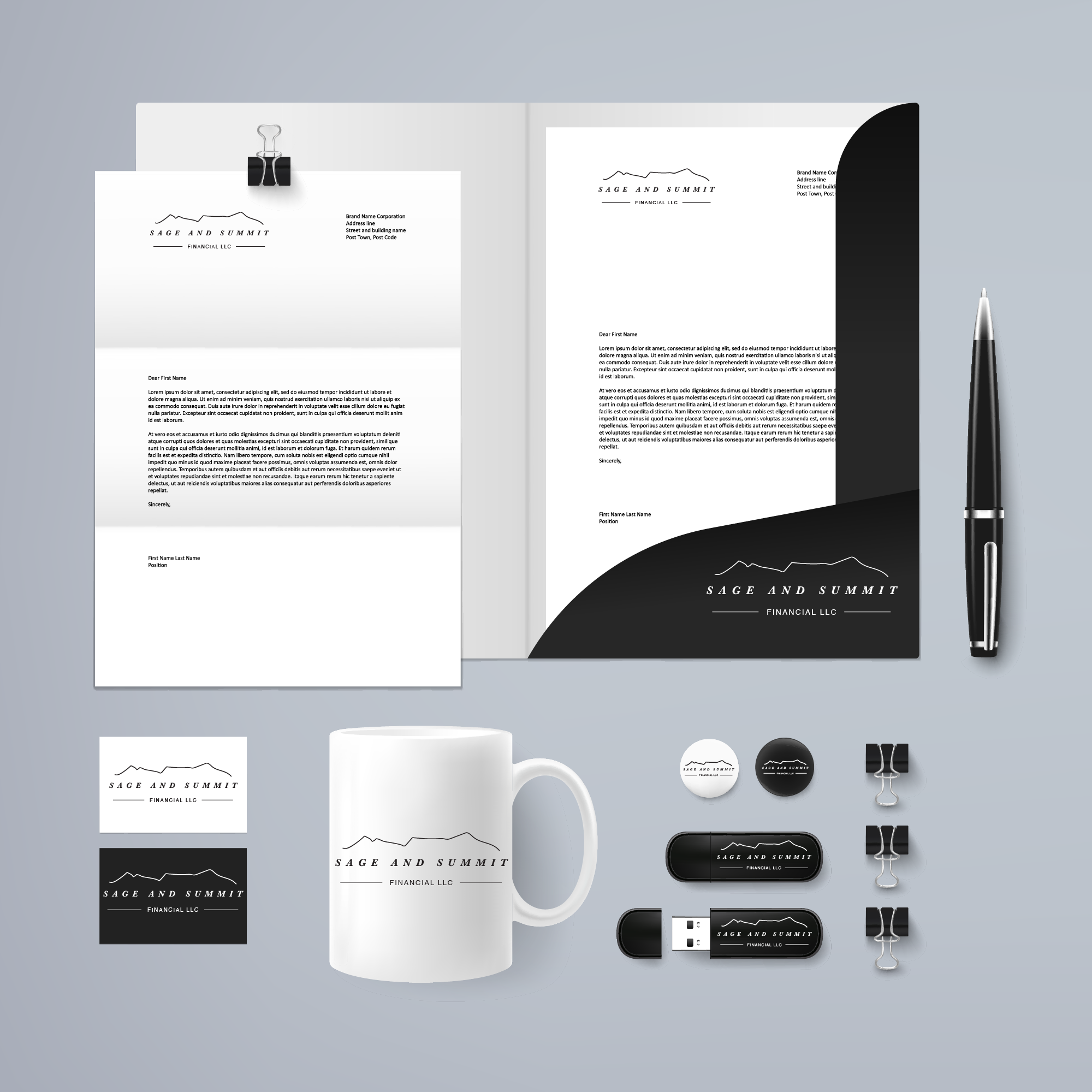
Versatility
The logo was tested across applications—business cards, letterheads, apparel, merchandise, and digital platforms. Its minimal line work ensures clarity and adaptability to a large amount of uses.

Final Thoughts
The resulting identity combines minimal mountain imagery with structured typography, creating a strong yet approachable brand system. The design works as a reflection of the company’s geographic roots, values of stability and wisdom, and mission of guiding clients toward their financial summits.
Stationery: Business cards, letterheads, and folders.
Merchandise: Branded mugs, USB drives, apparel.
Digital & Print: Logos adapted for social media, email signatures, and professional documents.